
Friday, 23 December 2011


Mission Statement
The new project PIONEER is a different kind of music magazine, focusing on pushing the unknown forward. It aims to bring recognition to smaller and unsigned bands, while also celebrating alternative music that has reached the mainstream limelight. PIONEER also embraces past artists from the origins of alternative music.
PIONNER is aimed at the 16 - 24 attitude and mindset, but each reader is there own person. They are independent with their own opinions, they are not interested in conforming. They love the excitement in life and searching for new and different things.
PIONEER contains all the essential information on all the artists and prvides the readers with the upcoming artists to look out for. PIONEER is always on the look out for new and upcoming bands and aims to help them reach further regognition. PIONNER embraces the idea of being different. Each week, PIONNER will contain several album and live reviews along with full length articles and interviews.
PIONEER will neither preach nor patronise, but will simply give credit it when deserved. It's role is to inspire and entertain.
Sunday, 11 December 2011
Questionaire Evaluation
I asked a number of people to answer some questions, in order to get some ideas to base my own music magazine front on.
The first question I asked was which masthead they thought would best suit an alternative music magazine. The most popular was "Pioneer" with a strong seven votes. "Venture" had one vote, however, "soundscape" didn't recieve any.
The most popular slogan was "For the 'daydream nation' " with five votes, and the next popular was "Unknown Pleasures" with two votes. "Embracing the past and present" and "Lost Treasures" didn't appear to be that popular with "Lost Pleasures" recieving no votes, and the other just one.
The majority of the people asked liked the idea of having both genders featured on the front cover, however, one person would have prefered to have males only.
Four of the people asked thought three people on the cover, and the same amount of votes was given for two people on the front cover. This gives a clear indication to not feature any more than three models on the cover, but not to include any less than two.
In terms of how the main image should be structured, the majority would want a medium close-up, which had five votes. Two people would have liked a full length image, and only one would like a close-up image.
When asked about whether they would prefer the main image to be in full colour or in black and white, there was no majority vote one way. The divide between the two was equal, with four votes given to each.
I also asked what colours they would like on a front cover, in oder to make up the overall colour scheme, in which black was the most popular, as it was given seven votes. White also appeared to be popular with six votes. Blue was the next popular with three votes. Red anf grey was liked by a few, which had two votes each. One vote was given to green and so it is very likely I wo't include this on the cover.
Finally I asked them to choose up to four different topics that they would like featured within the magazine. The most popular of these was upcoming artists with a strong eight votes. Six of the people asked wanted album reviews, and interviews, live reviews, and information of forthcoming gigs were all given a strong five votes. The only option that didn't seem popular with the majority was competitions.
Saturday, 10 December 2011
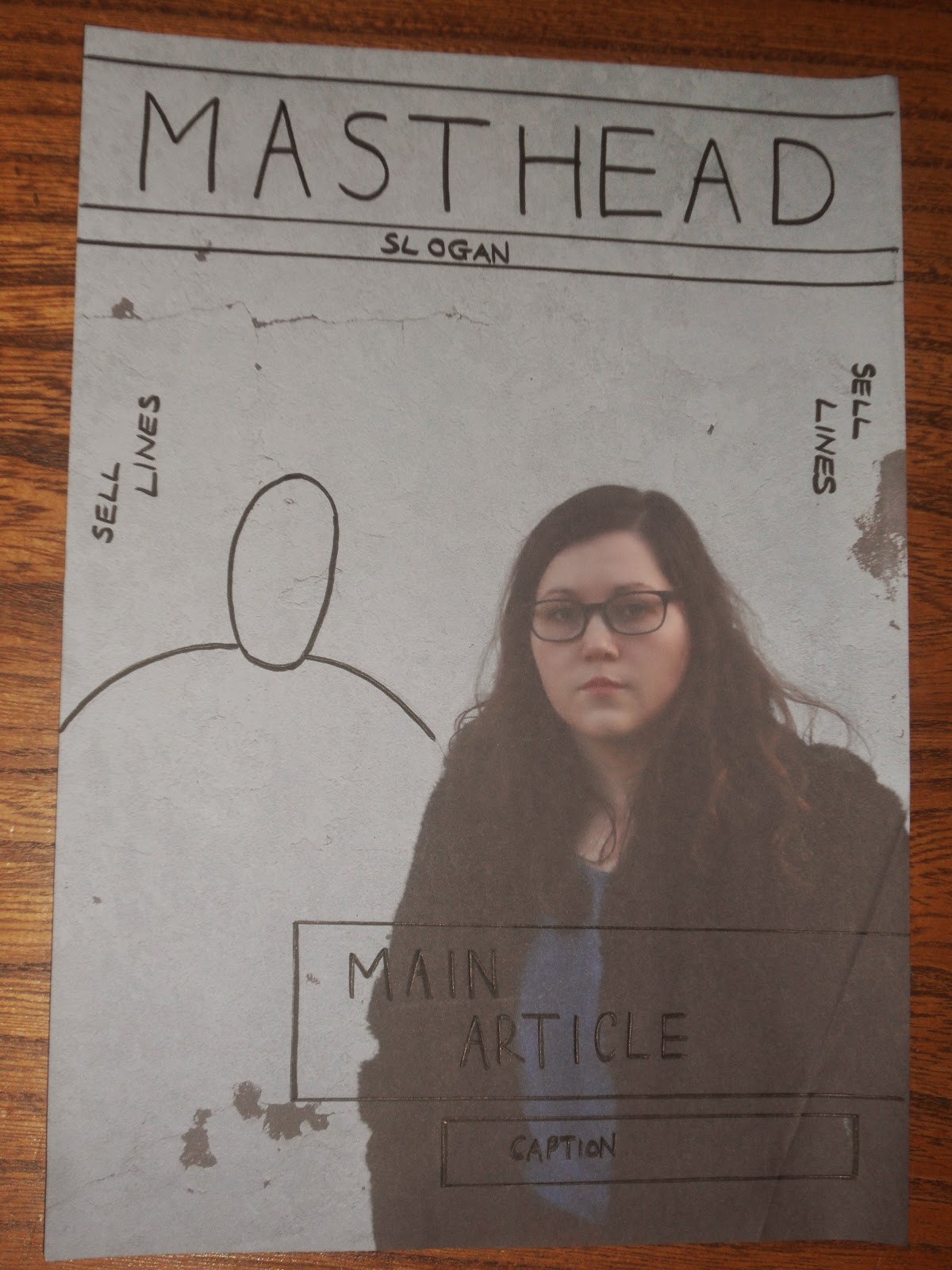
Temporary Front Cover Image

When designing my front cover, I will do so as if there was a male model to the left of the female because as that is how intend my image to be.
Front Cover Images
Below are the temporary images for my front cover until my preferred models are available:


I wasn't pleased with the two photos above as I don't think the setting suits the theme I wanted to go for. Also, I don't think the image is overall strong enough for a front cover image.

I prefer the last two images, mainly because I think they are more effective in terms of a main image. There is less going on also, the background is quite plain which seems to look better overall.
Here are some images that I found that I took inspiration from for my own front cover image.


The models I planned to use for my front cover are unavailable until after the deadline, so I plan to take some images with a model who was available. This way I can still work on the cover and have it handed in by the deadline, however, ideally I would like both a male and female in the cover and so plan to take more images when both are available.
Wednesday, 7 December 2011
More Front Cover Analysis
Before drawing some rough drafts of my own, I thought I would analyse more music magazine covers which are more relevant in terms of how I plan to make mine. I have decided to have two people on my own cover, and so have looked at a number of magazine covers which have done the same.
 The thing I particularly like about this magazine cover is the fact that all the sell lines are found on the one side of the magazine which gives it a simplistic design in which I think is very effective. I also like the colour chose here, and also the fact that they have chosen to stick to just a few colours. This makes the magazine look quite sophistic as there isn't too much going in on.

This cover has a similar image to the previous one, but just more close - up, which is just as strong. I like to use of the deep pink as I think this is very effective against the grey shadowing of the background. I like the grid structure of the sell lines, with it not cutting into the faces of the cover artists, again choosing a limited amount of colours.
I like the simplistic design of both, which I think would best suit my magazine cover.
Monday, 5 December 2011
Music Magazine Questionaire
1. Which masthead do you think would suit an alternative music magazine best?
- Pioneer
- Soundscape
- Venture
2. Which of the following slogans do you prefer?
- For the "daydream nation"
- "Unknown Pleasures"
- Lost Treasures
- Embracing the past and the present
3. What gender would you like on the main image?
- Male
- Female
- Both
4. How many people would you want on the main image?
- 1
- 2
- 3
- 4
- 4+
5. How would you want the main image to be structured?
- Close-up
- Medium close-up
- Full length
6. Would you like the main image to be in full colour or in black and white?
- Black + white
- Full Colour
7. What colours would you like to see on the front cover?
- Blue
- Green
- White
- Red
- Black
- Purple
- Orange
- Yellow
- Pink
- Grey
8. Which of the following topics would you like to be included in the magazine? Choose up to 4
- Interviews
- Upcoming Artists
- Live Reviews
- Album Reviews
- Forthcoming Gigs
- Competitions
- Other (please specify)
Sunday, 4 December 2011
Thursday, 1 December 2011

Subscribe to:
Comments (Atom)